In MapDashboard, you can add map subcomponents after
adding map components, including Zoom, Pan, Scale, Overview Map, Layer
List, Coordinate Converter, Layers Manager, Measure, Legend, Data Query,
POI Search, and Open File, Compass, LayerColor, Attributes, etc. Click
on "Components" in the left sidebar, select the components you
want to add under the category of "Map Subcomponents", and add
them to the dashboard by dragging.
The function of the map subcomponents is almost the
same as the sub-components in
the map component configuration items. The difference is that the map
subcomponents can be dragged and dropped to any position on the dashboard.
All map subcomponents need to be associated with the map before using.
Click the added map subcomponent and select the associated map in the
"Associated Map" on the right sidebar.
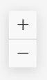
Zoom
The zoom component can zoom the size of the map. The
configuration items of the zoom component are as follows:
- Slide Bar: Whether to support the adjustment
of the zoom level in the form of a slide bar
- Font Color: The color of the symbol in the
zoom component
- Background Color: the background color of the
zoom component
- Size: The size of the zoom component, in pixels
Pan
The pan component can pan the map to browse the map
in different areas. The configuration items of the pan component are as
follows:

- Step: The distance the map moves after each
click on the pan component
- Size: The size of the pan component, in pixels
Scale
The scale component can display the current scale of
the associated map. The configuration items of the scale component are
as follows:
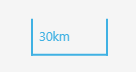
- Unit: The measuring unit of the line segment
scale
- Font Color: The font color of the scale
- Background Color: The background color of the
scale
- Size: The size of the scale component, in pixels
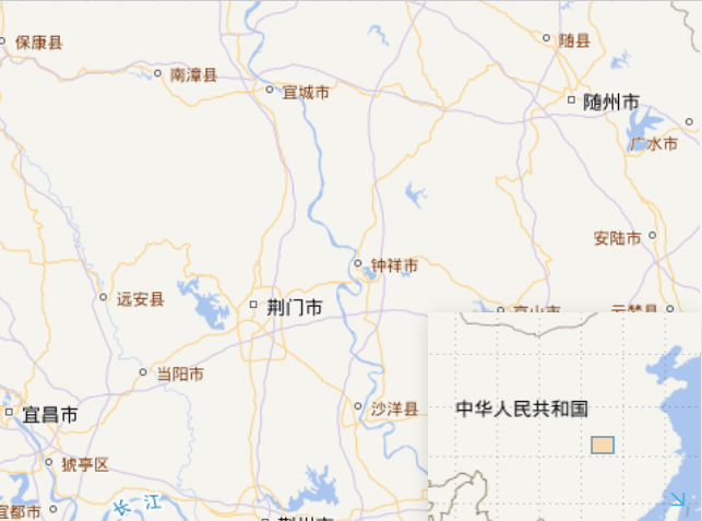
Overview Map
The overview map component can view the position of
the map in the window in the entire map.
The configuration items of the overview component are
as follows:
- Collapse by default: Set the overview map to
collapse or expand by default
- Rotate Icon: Whether the icon rotates when
the panel is expanded or collapsed
- Icon Position: The position of the indicator
icon in the overview map
- Font Color: The color of the indicator icon
- Background Color: The background color of the
overview map
- Size: The size of the overview map component,
in pixels
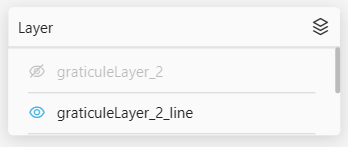
Layer List
The layer list component can control the visibility
of each layer in a map with multiple layers. Click the  icon in front of the layer name to show/hide the layer. The configuration
items of the layer list component are as follows:
icon in front of the layer name to show/hide the layer. The configuration
items of the layer list component are as follows:
- Collapse by default: Set the layer list to
collapse or expand by default
- Attributes Container: The container in which
the layer attribute table resides
- Background: The background color of the layer
attribute table
- Position: The position of the layer attribute
table in the container
- Width: The width of the layer attribute table
- Height: The height of the layer attribute table
- Icon Position: The position of the icon in
the layer list component
- Font Color: The color of the font and icon
in the layer list component
- Background Color: The background color of the
layer list component
- Size: The size of the layer list component,
in pixels
Coordinate Converter
The coordinate converter component can convert the
current coordinates of the map to other coordinate systems. The supported
coordinate systems include Web Mercator, UTM, Latitude and Longitude,
etc. The configuration items of the coordinate conversion component are
as follows:
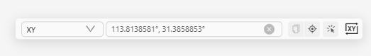
- Show Location: Whether to display the location
button, you can use the location button to locate the specified coordinate
location
- Collapse by default: Set the coordinate converter
component to collapse or expand by default
- Icon Position: The position of the coordinate
converter icon in the coordinate converter component
- Font Color: The color of the font and icon
in the coordinate converter component
- Background Color: The background color of the
coordinate converter component
- Size: The size of the coordinate converter
component, in pixels
Layers manager
The layers manager component can add multiple maps
to a map component and perform operations such as grouping, switching,
and overlaying the map. The configuration items of the layers manager
component are as follows:
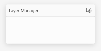
- Create Group: Click the
 icon to create a new map group, which supports nesting.
- Create Map: After selecting a group, click
on the
 icon to add
a map to the group. The added map must have the same coordinate system
as the associated map.
icon to add
a map to the group. The added map must have the same coordinate system
as the associated map.
- Group Default Expand: Whether to expand layer
group by default
- Title: The title of the layers manager component
- Collapse by default: Set the layers manager
component to collapse or expand by default
- Icon Position: The position of the layers manager
icon in the layers manager component
- Font Color: The color of the font and icon
in the layers manager component
- Background Color: The background color of the
layers manager component
- Size: The size of the layers manager component,
in pixels
Measure
The measure component can measure the linear distance
between any points on the map or the area of any polygon. The configuration
items of the measure component are as follows:
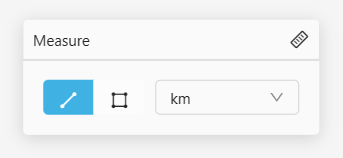
- Unit: The unit when measuring distance or area
- Distance: The default unit when measuring distance
- Area: The default unit when measuring area
- Display unit selection: Whether to allow the
unit selected during measuring
- Collapse by default: Set the measure component
to collapse or expand by default
- Icon Position: The position of the measure
icon in the measure component
- Font Color: The color of fonts and icons in
the measure component
- Background Color: The background color of the
measure component
- Size: Measure the size of the measure component,
in pixels
Legend
The legend component can help explain the features
in the thematic map. The configuration items of the legend component are
as follows:
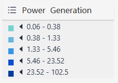
- Select Layers: Select the layer corresponding
to the legend
- Legend Title: The title of the legend component
- Legend Style: Whether the legend component
has a background panel
- Layer Name: Whether to display the layer name
corresponding to the legend
- Thematic Field: Whether to display the name
of the thematic fields corresponding to the legend
- Collapse by default: Set the legend component
to collapse or expand by default
- Icon Position: The position of the legend icon
in the component
- Font Color: The color of the font and icon
in the legend component
- Background Color: The background color of the
legend component
- Size: The size of the legend component, in
pixels
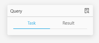
Data Query
The data query component can retrieve the features
in the map according to the query conditions. The configuration items
of the data query component are as follows:
- Title: The title of the data query component
- Data Sources: Select the data sources, supports
layers, public data, my data, service, etc., it also supports adding
multiple data sources:
- Layer: The added layer in the map component
- Public data: Public data in iPortal
- My data: Own data
- Service: Supports adding the iServer REST Map
Service, iServer REST Data Service, and iServer Address Matching Service
- Time series data: Supports two types of time
series data, fixed time and relative time (recent time). The data
response format supports GeoJSON/JSON, the response result should
be an object, and the key of the object is the Unix timestamp
- Max Returned Features: Set the maximum number
of returned features after the query, as the default value is 8
- Filter Condition: The condition of the feature
filter query
- Query Result Style:
- Point Style: Set the point features' style
returned by the query, support setting color, transparency, radius,
edge width, edge transparency, and edge color
- Line Style: Set the line features' style returned
by the query, support setting line width, transparency, and color
- Region Style: Set the region feature's style
returned by the query, support setting transparency, and color
- Region Border Style: Set the style of the region
features border returned by the query, support setting border width,
transparency, and color
- Collapse by default: Set the data query component
to collapse or expand by default
- Icon Position: The position of the data query
icon in the component
- Font Color: The color of the font and icon
in the data query component
- Background Color: The background color of the
data query component
- Size: The size of the data query component,
in pixels
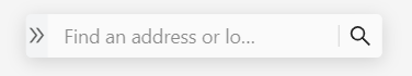
POI Search
The POI search component can use keywords to search
for POI in the map. The configuration items of the POI search component
are as follows:
- Data Sources: The search source of POI search,
supports layers, public data, my data, and service, etc., supports
adding multiple search sources:
- Layer: The added layer in the map component
- Public data: Public data in iPortal
- My data: Own data
- Service: Supports adding the iServer REST Map
Service, iServer REST Data Service, and iServer Address Matching Service
- Time series data: Supports two types of time
series data, fixed time and relative time (recent time). The data
response format supports GeoJSON/JSON, the response result should
be an object, and the key of the object is the Unix
timestamp
- Max Returned Features: Set the maximum number
of returned features after the query
- SuperMap Online Local Search: Whether to turn
on SuperMap
Online local search service
- Collapse by default: Set the POI search component
to collapse or expand by default
- Icon Position: The position of the POI search
icon in the POI search component
- Font Color: The color of the font and icon
in the POI search component
- Background Color: The background color of the
POI search component
- Size: The size of the POI search component,
in pixels
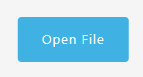
Open File
The Open File component can open the local data file,
loading and rendering it to the associated map, the configuration items
of the open file component are as follows:
- Render to Map: whether to load and render the
opened data file to the associated map
- Fit Bounds: Whether to transfer the current
angle of the map to the rendered data
- Clear Last Layer: When opening the new file,
whether to clear the last loaded file
- Message Prompt: whether to allow pop-up message
prompt of loading results
- Button: The button style of the open file component
- Text: The title text of the open file component
- Font size: The text font size of the open file
component
- Border Radius: The border radius of the round
corners around the open file component
- Supported File Formats: The file formats that
are supported to load, currently include: JSON, GeoJSON, CSV, EXCEL,
Shapefile
- Point style: Point feature style in the loaded
data file:
- Transparency: The transparency of point features
- Color: The color of point features
- Radius: The radius of point features
- Outline Width: The outline width of point features
- Outline Opacity: The opacity of point features
- Outline Color: The outline color of the point
features
- Line Style: The line feature style in the loaded
data file:
- Line width: The width of line features
- Opacity: The opacity of line features
- Color: The color of line features
- Region style: The region feature style in the
loaded data file:
- Opacity: The opacity of the region features
- Color: The color of the region features
- Size: The size of the open file component,
in pixels
Compass
The compass component can indicate the map direction.
The configuration items of the compass component are as follows:

- Pitch Angle: Whether the compass component
adjusts the indicated direction according to the map pitch angle
- Font Color: The icon color of the compass component
- Background Color: The background color of the
compass component
- Size: The size of the compass component, in
pixels
LayerColor
The LayerColor component can change the color of the
layer features in the map and configure the map style flexibly. The configuration
items of the LayerColor component are as follows:
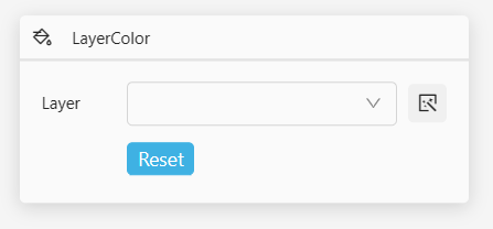
- Collapse by default: Set the LayerColor component
to collapse or expand by default
- Capture: Whether to enable mouse capture, click
on the map to capture the layer feature of the current location
- Icon Position: The position of the LayerColor
icon in the LayerColor component
- Font Color: The color of the text and icon
of the LayerColor component
- Background Color: The background color of the
LayerColor component
- Size: The size of the LayerColor component,
in pixels
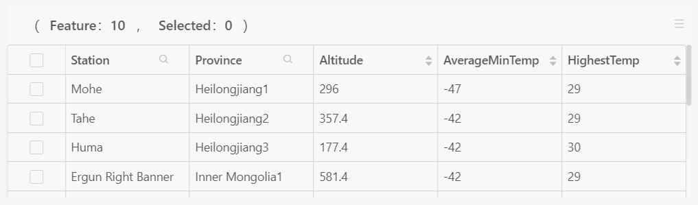
Attributes
The attributes component can display the specified
data in an attribute table and associate it with the map. The configuration
items of the attributes component are as follows:
- Data Sources: The data sources of the attributes
component, supporting layers, public data, my data and service, etc.:
- Layer: The added layer in the map component
- Public Data: Public data in iPortal
- My Data: Own data
- Service: Support iServer REST Data Service
- Associate with Map: Whether to associate the
attribute table with the map. After associating, clicking on the data
in the attribute table will generate a linkage effect with the map,
and it supports setting the linkage operations and feature styles
- Table Header: Header configuration of the attribute
table:
- Title: The title name of the attribute table
header
- Statistics: Whether to enable statistics on
the total number of data and statistics on the currently selected
data
- Toolbar: Whether to display the toolbar, the
functions of the toolbar include refreshing option, zooming to features
option, clearing selected option, columns control option, etc.
- Content: Content configuration of the attribute
table :
- Data: Configuring data column content in the
attribute table, including title, width, alignment, whether to support
search, whether to support sorting, etc.
- Table Header: Whether to display the header
of the attribute table data
- Column: Configure the height of each column
and whether to display the column borders
- Pagination: Attribute table paging configuration,
support setting the number of items per page and the default current
page number
- Font Color: The font color of the attributes
component
- Background Color: The background color of the
attributes component
- Size: The size of the attributes component,
in units