In a broad sense, map components include Map components,
Scene components, and Map Swipe components. As the basemap or background
of the dashboard, the map components is the main part of the dashboard.
Therefore, you can give priority to adding map components when making
dashboards. Click "Components" in the left sidebar, select these
components you want to add under the "Map" category, and add
them to the dashboard by dragging and dropping:
Map component
The map component is mainly used to display the two-dimensional
map. The settings of the map component are as follows:
Map selecting
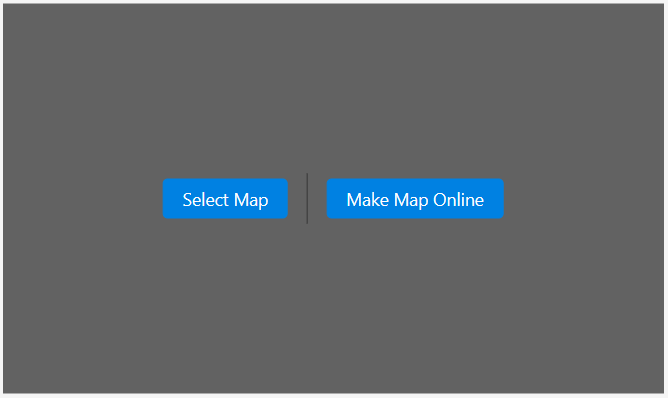
Select the added map component and click on the "Select
Map" item in the right sidebar to select a map. The MapDashboard
supports adding the following types of the map:
- Public maps: Map resources with viewable or
editable permissions in iPortal. It supports to add maps in DataViz
and MapStudio WebApp and retrieval based on keyword.
- My maps: Map resources of yourself. It support
to add maps in DataViz and MapStudio WebApp and retrieval based on
keyword.
- SuperMap Online maps: Support accessing to
online maps in SuperMap Online
- Internet maps: Support adding Internet maps
such as Tianditu map, Tianditu image, Tianditu terrain, etc. You must
have the Tianditu Key to add the Tianditu map
- Service: SuperMap iServer REST map service,
the format example is as follows: http://{server}:{port}/iserver/services/{component}/rest/maps/{mapName}
Note:
- Currently, Maps made using the sample data
in DataViz and MapStudio WebApp are not supported.
- When selecting a map, if you do not check
"Proxy", it will be obtained based on the browser client;
after checking, the iPortal server will send a request to get the
map, which is suitable for the different environments between client
and server or cross-domain access restrictions, etc. you can choose
according to the actual situation.
Property setting
Click on the added Map component, and all the properties
of the Map component will be listed on the right sidebar. You can configure
the following configuration items:
- Map name: Support modifying the name of the
map
- Fixed Map: Whether to fix the map zoom ratio,
you can choose "fixed", "not fixed" or "fixed
on mobile terminal". This setting item only takes effect in preview
mode.
- Render World Copies: Render multiple copies
of the world side by side beyond -180 and 180 degrees longitude, only
valid when projection is global
- Center Point: Directly type in the latitude
and longitude coordinates of the center point of the map, or use the
mouse to drag the center point of the map
- Zoom level: Directly type in the zoom level
of the map, or use the scroll wheel to set the zoom level of the map
- Rotation Angle and Inclination: Set the rotation
angle and inclination of the map. The range of the rotation angle
is -180°-180°, while the range of the inclination is 0-60°. You can
directly enter the value, or move the mouse over the map component
while holding down the "Ctrl" key to set
- Raster Tile Size: Set the size of a single
raster tile
- Add Sub-components:
The map component provides a variety of sub-components for assisting
map display and interactive operations. You can open the sub-component
folding menu and selectively enable it through the "show/hide"
icon next to the sub-component name:
- Zoom: Used to zoom the map, support to change
the position, font color, background color of the zoom component,
and whether to open the slider bar, etc.
- Pan: Used to browse maps of different areas
and supports to change the position, step and size of pan components
- Scales: Used to display the current scale of
the map, and support to change the position, unit, font color, background
color and size of the scale component
- Overview Map: Open the Overview Map to view
the map location in the window on the entire map, and support to change
the position, font color, background color of the overview components,
and whether to collapse by default, whether to rotate icon, etc.
- Layer List: For maps with multiple layers,
you can control the visibility of each layer through the layer list
component, support to change the position, font color, background
color of the layer list component, and whether to collapse by default,
whether to display attributes, etc.
- Measure: Measure the straight-line distance
between any points on the map or the area of any polygon, support
to change the position, font color, background color, default measurement
unit of the measurement component, and whether to display unit selection,
whether to fold by default, etc.
- Data Query: After adding a data source, you
can query the eligible elements of the data based on specific attribute
conditions and display them on the map. Support to change the title,
data source, filter condition, maximum return number of elements,
query result style, component position, font color, background color
of data query components, and whether to collapse by default
- POI search: Use key characters to search for
POI in the map, support setting the search source, the maximum number
of returns, whether to open SuperMap Online local search, change the
location of the POI search component, font color,
background color, and whether to collapse by default, etc.
- Identify: When selecting features in the vector
layer, the attributes of the selected features will be searched and
displayed. The identify component supports specifying the search layers
and the displayed fields, as well as modifying the highlight style
of the selected features and the popup style. The displayed field
types include text, hyperlinks, images, and videos.
- Layer Manager: After adding multiple layers
to the map component, it supports switching between multiple layers
and superimposed display. The layermanager component supports grouping
multiple layers, changing the title, position, font color, background
color, and whether to collapse by default, etc.
- Compass: Display the north-south direction
of the current view of the map, supports changing the position, font
color, and background color, adjusting the orientation according to
the pitch angle of the map, etc.
- Coordinate Conversion: Convert the current
coordinates of the map to other coordinate systems, support changing
the position, font color, background color of the coordinate conversion
component, whether to display the positioning button, and whether
to collapse by default, etc.
- LayerColor: Configure the color of each layer
in the map, support changing the position, font color, background
color of the layer color components, whether to enable mouse capture,
and whether to fold by default, etc.
Sub-layers adding: The map component
supports adding new sub-layers on the map. You can open the sub-layers
folding menu, select the type of layer you want to add, and click
the "Add" button to add a sub-layer:
- Dynamic Markup Layer: Dynamic markup layer
can add the features in the data source to the map component in the
form of dynamic markers. You can set the layer name, data source,
mark type, color and highlight color of the dynamic markup layer,
and whether to display data fields, etc.; according to the different
types of markers, you can adjust the specific styles of markers such
as width and height; dynamic markup layer also supports setting filter
conditions, filtering out the features that meet the conditions for
display, and supports setting the maximum value of returned features
- Tracking Layer: The tracking layer can dynamically
display the trajectory of an object, which is suitable for scenes
such as tracking and navigation. You can set the layer name, data
source (must be time series data), model data type (support OBJ2,
GLTF, picture format), track line type and style of the tracking layer,
etc.
Add Tianditu Sub-components: The map component
docks with part of the Tianditu Web service API, which is available
as a sub-component for you to choose; you can open the Tianditu sub-component
folding menu, enter the Tianditu service key, and open the "Show/Hide"
icon next to the Tianditu sub-component name to enable:
- Route planning: Enter the starting point and
ending point to query the route. Support to change the title, position,
font color, background color of the route planning component, and
whether to collapse by default, etc.
- POI search: Enter an address or place name
and search for its corresponding location on the map. Support changing
the position, font color, background color of the POI search component,
and whether to collapse by default, etc.
- Map Switcher: Switch the current map to Tianditu
vector, Tianditu image, Tianditu terrain. Support to change the position,
font color, background color of the map switcher component, and whether
to collapse by default, etc.
- Feature Style: Set the feature style of the
map. The unique map supports setting the style of point, line, and
area features and the border style of area features.
- Highlight Style: Set the feature highlight
style of the map. The unique map supports the highlighting of point,
line, and area features and the highlighting of area borders.
- Background Color: Set the background color
of the map
- Size: Set the width and height of the map in
pixels. You can also change the size of the map by clicking and dragging
the anchor points around the map component
Scene component
The scene component is mainly used for the display
of the 3D scene. The setting items of the scene component are as follows:
Scene selecting
Select the added Scene component and click on the "Select
Scene" button in the right sidebar to select a scene. The MapDashboard
supports adding the following types of the scene:
- Public scenes: Scenes resources with viewable
or above permissions in iPortal, support retrieval based on key characters
- My scenes: Scenes resources of yourself, support
retrieval based on key characters
Property setting
- Coordinates: the coordinates of the scene center
point, including the longitude, latitude and height. You can adjust
scene to the appropriate position by dragging the scene, scrolling
the scene by holding down the mouse wheel, and changing the scene
coordinates.
- Longitude: The longitude of the scene center
- Latitude: The latitude of the scene center
- Height: The height of the scene center from
the ground
- Orientation: the azimuth Angle of the scene,
including heading, roll and pitch angle. You can adjust scene to the
appropriate orientation by scrolling the scene when holding down the
mouse wheel, and changing the scene coordinates.
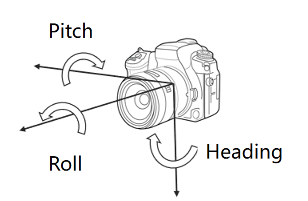
- Heading: The Angle formed by the current rotation
of the viewpoint around the roll axis
- Roll: The Angle formed by the current rotation
of the viewpoint around the yaw axis
- Pitch: The Angle formed by the current viewpoint
rotating around the pitch axis
- About to MasterPage: Turn on the toggle, the
coordinates and orientation of the current scene will be consistent
with the corresponding scene in the MasterPage. This operation will
only be effective in the current page.
- Scan: Add dynamic scan effect of the scene,
support setting scan mode, scan center point, scan period, scan speed,
and other parameters of scene scan
- Size: Set the width and height of the scene
in pixels. You can also change the scene size by clicking and dragging
the anchor points around the scene component
Map Swipe component
The map swipe component can display two maps at the
same time, which is mainly used to interactively compare the same area
of the two maps. The settings of the map swipe component are as follows:
- Center Point: Directly type in the latitude
and longitude coordinates of the center point of the map, or use the
mouse to drag the center point of the map
- Zoom: Directly type in the zoom level of the
map, or use the scroll wheel to set the zoom level of the map
- Rotation Angle and Inclination: Set the rotation
angle and inclination of the map. The range of the rotation angle
is -180°-180°, and the range of the inclination is 0-60°. You can
directly enter the value, or press and hold the right button on the
map component and move the mouse to set
- Map Settings: For the maps added in the map
swipe component, you can set the sub-components and sub-layers separately.
For specific setting methods, see: Map component
- Axis Style: the style setting of the map scroll
axis
- Direction: The arrangement direction of the
map in the map wipe components, supports both horizontal and vertical
- Line style: the style of the map roller shutter
axis, support line width, and color settings
- Slider style: The style of the map scrolling
slider, which supports setting the size and color of the slider
- Size: The width and height of the map swipe
component, in pixels. You can also change the scene size by clicking
and dragging the anchor points around the swipe component
Display map/scene in Multiple views
MapDashboard supports display different views of the
map/scene in different pages. By configuring the center point, level,
azimuth and other states of the map and scene individually in the pages,
the map and scene will animate to the state of the current page when switching
the page.
Operation: Select the map or scene component in the
page, then in the right hand property panel, you can adjust the center
point, zoom level, rotation Angle, tilt Angle of the map, etc., or adjust
the coordinates, orientation of the scene, etc. to set the perspective
of the map or scene in the current page. You can also turn on the 'About
to MasterPage' toggle, and the view of the map or scene in the current
page will be consistent with the MasterPage.