Data components contain data switcher and timeline
series components, etc. Click the "Components" item on the left
toolbar and select the components to be added under the "Data"
category. You can add components via drag and drop:
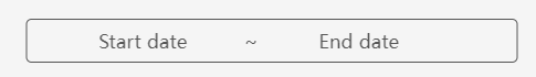
Range Picker component
By associating with time data, the range picker component
is designed to select start and end times to show the data within a certain
time range.
In the range picker component, you can determine the
date range by selecting the Start date and End date. When the Time Select
toggle in the right panel is on , you can further click "select time"
in the component to select the hour, minute and second.
The configuration items of range picker are as follows:
- Linked Data: The data source of range picker.
The data type is limited to time data, and it supports to associate
with multiple time data.
- Time Select: Whether to further select hour,
minute and second on the range picker. When the toggle is on, the
range picker component can be accurate to the second, and when the
toggle is off, it only can be accurate to the date.
- Font: The font type of text in range picker,
which defaults to Microsoft Yahei.
- Font size: The font size of text in range picker,
which defaults to 14 pixels.
- Font color: The font color of text in range
picker.
- Background: The background settings of range
picker.
- Color: The background color of range picker.
- Gradient: Whether to turn on the gradient effect.
You can choose the direction of the gradient effect if it is turned
on, and gradient color is related to the background color of components.
- Background image: The background image of components.
You can directly select the built-in image materials of the dashboard
as the background or add a custom background image in two ways, which
are entering the image address and uploading the image. You can also
set the image repeating effect.
- Size: The size of range picker components and
the unit is pixel.
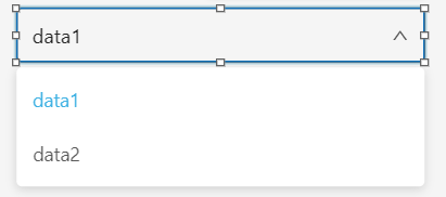
Data switcher component
You can associate multiple data and switch between
data with data switcher component. After data switcher is bound to the
chart, text list and other types of components, the bound components will
change according to the current data to present multi-dimensional data.
The configuration items of data switcher are as follows:
- Name: The name of data switcher.
- Field: Data item The data source of data switcher.
You can add multiple data sources, but the return content format of
each data source must be consistent.
- Text: The text format of data switcher.
- Font size: The font size of text in data switcher,
which defaults to 15 pixels.
- Font color: The font color of text in data
switcher, which defaults to white.
- Select box: The select box's style of data
switcher.
- Maximum height: The maximum height of drop-down
items in select box.
- Border radius: The border radius of select
box.
- Border color: The border color of select box.
- Background: The background settings of data
switcher.
- Color: The background color of components.
- Gradient: Whether to turn on the gradient effect.
You can choose the direction of the gradient effect if it is turned
on, and gradient color is related to the background color of components.
- Background image: The background image of components.
You can directly select the built-in image materials of the dashboard
as the background or add a custom background image in two ways, which
are entering the image address and uploading the image. You can also
set the image repeating effect.
- Size: The size of data switcher and the unit
is pixel.
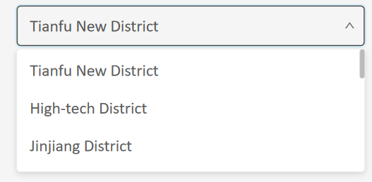
Data filter component
Data filter component supports filtering the displayed
content of components such as maps, charts and text list component through
interactive configuration. For example, if select a data item in data
filter component, the feature or data corresponding to that data item
will be highlighted in the map, chart, or text list component.
The configuration items of data filter are as follows:
- Data Sources: The data source of data
filter component
- Field: The field need to be filtered and displayed
- Text: The text style of the data filter component
- Font Size: The font size of the text in data
filter component, default in 15 pixels default
- Font Color: The font color of the text in data
filter component, default in white color
- Selection Box: The style of selection box in
data filter component
- Maximum Height: The maximum height of the drop-down
item in the selection box
- Border Radius: The border radius of the selection
box
- Border Color: The border color of the selection
box
- Background: The background setting of the data
filter component
- Color: The background color of the component
- Gradient: Whether to enable the gradient effect.
If enabled, you can also choose the direction of the gradient effect.
The gradient color is related to the background color of the component
- Background Image: The background picture of
the component, you can directly select the built-in picture material
as the background or add a custom background picture. When customizing
the background picture, you can add it by entering the picture address
and uploading the picture. You can also set the picture repeating
effect
- Size: The size of the data filter component
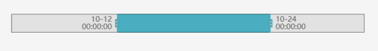
Time range component
You can control the range of data displayed with time
range component cooperating with time data, suitable for historical data
playback and other scenes.
The configuration items of time range are as follows:
- Name: The name of time range.
- Linked data: The data source of time range.
The data type is limited to time data.
- Label Style: The label's style of time range.
- Axis label: The display format of time.
- Font: The font family of time range's label,
which defaults to Microsoft Yahei.
- Font size: The font size of time range's label,
which defaults to 12 pixels.
- Font color: The font color of time range's
label, which defaults to white.
- Font weight: The settings for font weight of
time range's label, including Lighter, Normal, Bold, etc.
- Line height: The height settings for each line
of text and the unit is pixel.
- Color: The color of time range.
- Background color: The background color of time
range.
- Border color: The border color of time range.
- Fill color: The fill color of select box.
- Background: The background settings of time
range.
- Color: The background color of components.
- Gradient: Whether to turn on the gradient effect.
You can choose the direction of the gradient effect if it is turned
on, and gradient color is related to the background color of components.
- Background image: The background image of components.
You can directly select the built-in image materials of the dashboard
as the background or add a custom background image in two ways, which
are entering the image address and uploading the image. You can also
set the image repeating effect.
- Size: The size of time range and the unit is
pixel.
Time line component
Data at a specific time node can be displayed with
time line component cooperating with time data.
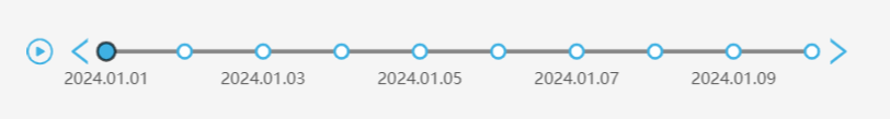
The configuration items of time line are as follows:
- Name: The name of time line
- Type: Includes time data, time map, custom
data and custom map.
- Linked data: The data source of time line.
- Label Style: The label's style of time line.
- Axis label: The display format of time.
- Font: The font family of time line's label,
which defaults to Microsoft Yahei.
- Font size: The font size of time line's label,
which defaults to 12 pixels.
- Font color: The font color of time line's label,
which defaults to white.
- Font weight: The settings for font weight of
time line's label, including Lighter, Normal, Bold, etc.
- Font line height: The height settings for each
line of text and the unit is pixel.
- Line style: The style of timeline:
- Color: The color of timeline.
- Width: The width of timeline.
- Highlight color: The color of timeline when
highlighted.
- Highlight border color: The border color of
timeline when highlighted.
- Line type: The line style of timeline, including
solid line, dashed line, dotted line.
- Play: The play settings of time line.
- Control button: Whether to display control
buttons such as play, forward, and back on both ends of the timeline.
- Auto play: Whether to turn on the automatic
play function.
- Interval: Play interval for turning on the
automatic play function.
- Display: Whether to display time line component.
- Background: The background settings of time
line.
- Border color: The border color of time range.
- Color: The background color of components.
- Gradient: Whether to turn on the gradient effect.
You can choose the direction of the gradient effect if it is turned
on, and gradient color is related to the background color of components.
- Background image: The background image
of components. You can directly select the built-in image materials
of the dashboard as the background or add a custom background image
in two ways, which are entering the image address and uploading the
image. You can also set the image repeating effect.
- Size: The size of time line and the unit is
pixel.
Time player component
Data change process can be displayed continuously with
time player component cooperating with time data.
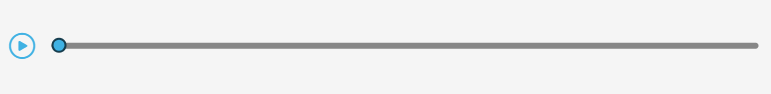
The configuration items of time player are as follows:
- Name: The name of time player
- Linked data: The data source of time line.
The data type is limited to time data.
- Label style: The label's style of time player.
- Axis label: The display format of time.
- Font: The font family of time player's label,
which defaults to Microsoft Yahei.
- Font size: The font size of time player's label,
which defaults to 12 pixels.
- Font color: The font color of time player's
label, which defaults to white.
- Font weight: The settings for font weight of
time player's label, including Lighter, Normal, Bold, etc.
- Line style: The style of timeline
- Color: The color of timeline.
- Width: The width of timeline.
- Slider color: The color of slider.
- Slider border color: The border color of slider.
- Play: The play settings of time player.
- Control button: Whether to display control
buttons such as play, forward, and back on both ends of the timeline.
- Auto play: Whether to turn on the automatic
play function.
- Loop play: Whether to loop play after the time
player playback end.
- Interval: Play interval for turning on the
automatic play function.
- Size: The size of time player and the unit
is pixel.