Basic components contain time components,
text components, text list components, indicator components, icon components,
image components, video components,video plus components, iFrame components,
slideshow components, etc. Click the "Components" item on the
left toolbar and select the components to be added under the "Basic"
category. You can add different types of components via drag and drop:
Date&Time components
Date&Time components are used to display
the current time to enhance the real-time ability of dashboard.
The configuration items of time components are as follows:
- Time type: Display the styles of time. It defaults
to 'Date + Hour/Minute/Second + Day of the week'.
- Font: The font family of text in date&time
components. It defaults to Microsoft Yahei.
- Font size: The font size of text in date&time
components. It defaults to 18 pixels.
- Font color: The font color of text in date&time
components. It defaults to white.
- Background: The background settings of date&time
components.
- Color: The background color of components.
- Gradient: Whether to turn on the gradient effect.
You can choose the direction of the gradient effect if it is turned
on, and gradient color is related to the background color of components.
- Background image: The background image of components.
You can directly select the built-in image materials of the dashboard
as the background or add a custom background image in two ways, which
are entering the image address and uploading the image. You can also
set the image repeating effect.
- Size: The size of time components and the unit
is pixel.
Text components
You can add a paragraph of text with text components,
used as auxiliary instructions for the dashboard and so on.
The configuration items of text components are as follows:
- Data type: The data source of text. It supports
static data and selected data:
- Static data: Enter a paragraph of text in "Text
content" to add a paragraph of static text in the dashboard.
- Selected data: Select existing data in the
dashboard as the data source.
- Hyperlink: Add a href for text and click the
text to jump to the hyperlink address.
- Forward method: The form of hyperlink jump
window, which supports the options of "Open in New Window",
"Current Window", "Father Window", "Top Window",
etc.
- Text:
- Font: The font family of text, which defaults
to Microsoft Yahei.
- Font weight: The settings for font weight,
including thin, standard, bold, etc.
- Alignment: The alignment of text, which can
be aligned to the center,left, right, etc.
- Font line height: The height settings for each
line of text and the unit is multiple or pixel.
- Font size: The font size of text, which defaults
to 18 pixels.
- First line indentation: The indentation value
for the first line of text and the unit is pixel.
- Font color: The font color of text, which defaults
to white.
- Background: The background settings of text
components.
- Color: The background color of components.
- Gradient: Whether to turn on the gradient effect.
You can choose the direction of the gradient effect if it is turned
on, and gradient color is related to the background color of components.
- Background image: The background image of components.
You can directly select the built-in image materials of the dashboard
as the background or add a custom background image in two ways, which
are entering the image address and uploading the image. You can also
set the image repeating effect.
- Highlight style: The style when the text is
highlighted, the setting options are the same as the text that is
not highlighted
- Size: The size of text components and the unit
is pixel.
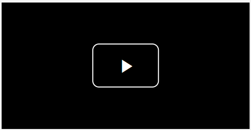
Text list components
You can add a data table with text list
components in MapDashboard.
The configuration items of text list components are
as follows:
- Data source: The data source of text list.
- Map layer: If the layer in the added map component
has data records, you can add the data records in the layer.
- Public data: Public data in iPortal.
- My data: the user's self data.
- Time data: Supports two types of time data,
fixed time period and relative time period (recent time). The data
response format supports GeoJSON/JSON, the response result should
be an object, and the key of the object is unix timestamp.
- Service: Supports iServer REST map service,
iServer REST data service, and third-party services whose response
data is GeoJSON/JSON format. Take the JSON format as an example:
{
"data": [
{
"A1":
"a1",
"B1":
"b1"
},
{
"A2":
"a2",
"B2":
"b2"
}
]
}
The configuration item specific to service type data
is as follows:
- Use iPortal proxy request: If it is not checked,
the request will be sent based on the browser client. If checked,
the request will be sent by the iPortal server, which applying to
situations such as different network environments between on the client
and server or cross-origin access restrictions. You can choose according
to the actual situation.
- Periodical refresh: You can set the interval
to refresh data periodically. The unit is second.
- List content: The content settings of text
list.
- Data: The content settings of single-column
data.
- Header: The header shown in the text list
component.
- Data column: Select the data item to be
displayed in the text list.
- Type: The type of data, supporting Text,
Link Address, Image type
- Forward method: The form of hyperlink jump
window, which supports the options of "Open in New Window",
"Current Window", "Father Window", "Top
Window", etc.
- Image Repeat: The image repeat way.
- Prefix: Support to add a prefix for the
column data item.
- Suffix: Support to add a suffix for the
column data item.
- Column width: Support to set the list width
for the column data item, when the value is 0, it will be adapt
to list width.
- Sort: Whether to sort the data in this column.
The sorting methods include ascending order and descending order.
- Max Rows: The maximum number of display rows
of data, display all data when the value is -1
- Threshold: Support to set one or more threshold
intervals for the column of data. The threshold display style is cell
display or text display.
- Style: The style settings of text list.
- Header: Whether to show header of the column
data item. Support to set the header height ( adapt to height
if the value is 0), background color and font color.
- Sort arrow: If you enable sorting, you can
set the default color and the selected color for the sort arrow.
- Row: Support to set the number of rows, row
height, font size, font color, background color of odd and even rows,
etc. displayed in the text list.0 represents auto fit in row height.
- Highlight color: The color of the text list
when highlighted.
- Scroll one by one: Whether to enable the effect
data scrolling one by one.
- Background: The background settings of text
list components.
- Color: The background color of components.
- Gradient: Whether to turn on the gradient effect.
You can choose the direction of the gradient effect if it is turned
on, and gradient color is related to the background color of components.
- Background image: The background image of components.
You can directly select the built-in image materials of the dashboard
as the background or add a custom background image in two ways, which
are entering the image address and uploading the image. You can also
set the image repeating effect.
- Size: The size of text list components and
the unit is pixel.
Indicator components
Indicator components are used for statistics
and presentation of business indicators through the combination of title
and value.
The configuration items of indicator components are
as follows:
- Data type: The data source of indicator. It
supports static data and selected data:
- Static data: Enter a fixed specific value in
"Data" to add an indicator with fixed value in the dashboard.
- Selected data: Select existing data in the
dashboard as the data source.
- Display: Whether to display title and unit.
- Title: Title of indicator. Static data indicators
can be set by entering text directly. Selected data indicators can
be set by selecting fields in the data source or entering text directly.
- Unit: Unit of indicator. Static data indicators
can be set by entering text directly. Selected data indicators can
be set by selecting fields in the data source or entering text directly.
- Arrangement: Arrangement of indicator, which
supports horizontal and vertical.
- Font weight: The settings for font weight,
including thin, standard, bold, etc.
- Font color: The font color of title and unit,
which defaults to white.
- Font size: The font size, which defaults to
18 pixels.
- Data: Indicator data. Static data indicators
can be set by entering text directly. Selected data indicators can
be set by selecting fields in the data source.
- Decimal places: The number of decimal places
displayed by indicators. It can be automatically set according to
the data, or you can select fixed decimal places
- Thousand separator: The separator per thousand,
which defaults to ','.
- Digital animation: Dynamic effect of changes
in values. The duration of the animation can be set after it is turned
on.
- Text: The style settings of indicator value,
support to set the font size, font color and font spacing.
- Threshold: Support to set one or more threshold
intervals and customize the display color of threshold in indicator
components.
- Background: The background settings of indicator
value.
- Background color: The background color
of indicator value.
- Background image: The background image
of indicator value.
- Separator background: Whether to turn on
the separator background effect.
- Margin: Set the spacing values between the
indicator and the top, bottom, left and right boundaries of the component.
- Background: The background settings of indicator
components.
- Color: The background color of components.
- Gradient: Whether to turn on the gradient effect.
You can choose the direction of the gradient effect if it is turned
on, and gradient color is related to the background color of components.
- Background image: The background image of components.
You can directly select the built-in image materials of the dashboard
as the background or add a custom background image in two ways, which
are entering the image address and uploading the image. You can also
set the image repeating effect.
- Size: The size of indicator components and
the unit is pixel.
Icon components
You can add a referential graphic symbol with icon
components in dashboard. A variety of common icons are preset in MapDashboard.
The configuration items of icon components are as follows:
- Select icon: Dozens of common icons are built-in,
and you can select the icon that meets your needs.
- Style: The style settings of icon components.
- Icon size: The size of icon and the unit is
pixel.
- Icon color: Foreground color of icon.
- Background: The background settings of icon
components.
- Color: The background color of components.
- Gradient: Whether to turn on the gradient effect.
You can choose the direction of the gradient effect if it is turned
on, and gradient color is related to the background color of components.
- Background image: The background image of components.
You can directly select the built-in image materials of the dashboard
as the background or add a custom background image in two ways, which
are entering the image address and uploading the image. You can also
set the image repeating effect.
- Size: The size of icon components and the unit
is pixel.
Image components
You can add any images with image components in dashboard
to enhance the visualization of the dashboard.
The configuration items of image components are as
follows:
- Image URL: URL address of the image. You can
directly select the built-in image materials of the dashboard or add
a custom image in two ways, which are entering the image address and
uploading the image. You can also set the image repeating effect.
- Hyperlink: Add a href for image and click the
image to jump to the hyperlink address.
- Forward method: The form of hyperlink jump
window, which supports the options of "Open in New Window",
"Current Window", "Father Window", "Top Window",
etc.
- Background: The background settings of image
components.
- Color: The background color of components.
- Gradient: Whether to turn on the gradient effect.
You can choose the direction of the gradient effect if it is turned
on, and gradient color is related to the background color of components.
- Size: The size of image components and the
unit is pixel.
Video components
You can add videos in .mp4/.webm/.ogv/.rtmp/.flv/.m3u8
and other formats with video components in dashboard.
The configuration items of video components are as
follows:
- Video address: URL address of the video.
- Poster Address: The poster of video component.
You can directly select the built-in image materials of the dashboard
as the poster or add a custom poster in two ways, which are
entering the image address and uploading the image. You can also set
the image repeating effect.
- Play: Video play settings
- Window: Set the form of window play, including
Pop-up Window, Full screen, etc.
- Loop play: Whether to loop the video after
the video playback ends.
- Auto play: Whether to start playing automatically
when opening the dashboard.
- Muted: Whether to mute when playing the video.
- Control bar: Whether to display the control
bar below the video when playing the video.
- Size: The size of video components and the
unit is pixel.
Video+ components
The Video+ component is suitable for industrial application
scenarios such as smart park management and security. Supports zoom and
roaming operation.
It can add HTML5 .mp4/.flv/.m3u8 and other formats
of video to the dashboard.
The Video+ component contains the following configuration
items:
- Video address: The URL address of the video.
- Video size: The size of the video, in pixels.
- Loop play: Whether to loop the video after
the video is played. This setting only takes effect in preview mode.
- Autoplay: Whether to start playing automatically
when opening the dashboard. This setting only takes effect in preview
mode.
- Size: The size of the Video+ component, in
pixels
iFrame components
You can embed a third-party web page in dashboard with
iFrame components to integrate existing web applications into the dashboard.
The configuration items of iFrame components are as
follows:
- URL address: URL address of the iFrame to be
embedded.
- Size: The size of iFrame components and the
unit is pixel.
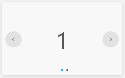
Slideshow components
You can play pictures or text in carousel with Slideshow
component. It can display information in a limited space in flexibly and
smoothly way.
The configuration items of Slideshow components are
as follows:
- Data Sources: The data source displayed in
slideshow, which is optional.
- Select existing data in the dashboard as the
data source, the slideshow will display the data content in pages.
- Do not select the data source, and you need
to configure the slideshow content in the Content configuration item.
- Content:The content settings displayed in slideshow
- Type: The content type of slideshow, supporting
Text and Image.
- Data: The data used as the slideshow content,
it can be configured by choosing field or customizing content
- Text: you can customize the text content
or choose a field after configuring the data source
- Image: you can customize image by selecting
the built-in picture material or adding a custom image in way
of entering the picture address or uploading the picture. You
can also choose a field after configuring the data source. The
field content must be the URL of the image. In addtion, you can
also set the picture repeating effect.
- Style: The style of text or image content
- Font size: The font size of text in slideshow
content and the unit is pixel.
- Font color: The font color of text in slideshow
content, which defaults to black.
- First Line Indentation: The first line
indentation of text in slideshow content and the unit is pixel.
- Alignment: The alignment of text in slideshow
content, including Left, Centered, Right, which defaults to Centered.
- Padding: The spacing value of the between
the top, bottom, left, and right boundaries of the text and the
component
- Width and Height: The width and height
of the image and the unit is pixel.
- Padding: The spacing values between the
text and the top, bottom, left and right boundaries of the component.
- Switch: The switch settings between slideshow
pages.
- Effect: The switching effect of slideshow,
including Classic, Cube, Turn page and Spin. You can set the switching
direction to horizontal or vertical, and whether to cycle switch,
namely returning to the first page after switching the last page in
slideshow.
- Control: Control switching operations with
mouse or keyboard.
- Mouse Control: Drag or click the switch
button to switch the slideshow page.
- KeyBoardcontrol: Control switching operations
by the arrow keys on the keyboard. The horizontal switch is controlled
by the left and right arrow keys, and the vertical switch is controlled
by the up and down arrow keys.
- Button: Controls the visibility of toggle buttons
on both sides of the slideshow
- Autoplay: Switch slideshow pages automatically
according to the set interval.
- Pagination: Slideshow pagination styles, including
Bullets, Fractions, and Progress bar.
- Background:The background settings of Slideshow
components.
- Color: The background color of components.
- Gradient: Whether to turn on the gradient effect.
You can choose the direction of the gradient effect if it is turned
on, and gradient color is related to the background color of components.
- Background image: The background image of components.
You can directly select the built-in image materials of the dashboard
as the background or add a custom background image in two ways, which
are entering the image address and uploading the image. You can also
set the image repeating effect.
- Size: The size of Slideshow components and
the unit is pixel.