Chart components include histogram charts, bar charts,
pie charts, gauges, scatter charts, line charts, radar charts, liquidfill,
progress bars, progress rings, etc.; click on "Components" in
the left sidebar, and click on "Charts", add the component you
want to add to the dashboard by dragging and dropping:
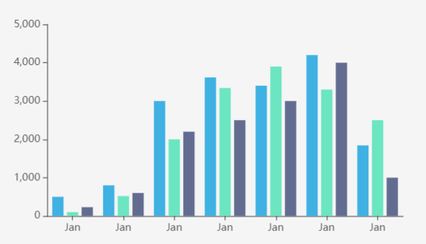
Histogram charts
The histogram uses the height of the bars as a variable
to indicate the data distribution. According to different styles, it can
be divided into histograms, cube histograms, cuboid histograms, cylindrical
histograms and other types.
The configuration items of the histogram are as follows:
- Data Source: The data source of the histogram,
divided into map layers, public data, my data, services and time-series
data/map.
- Map Layer: If the layer in the added map component
has data records, you can add the data recorded in the layer.
- Public Data: public data in iPortal
- My Data: own data
- Time-series data/map: support two types of
time series data, fixed time period and relative time period (recent
time), the data response format supports GeoJSON/JSON, the response
result should be an object, and the object's key value (key) is unix timestamp
- Service: supports iServer REST map service,
iServer REST data service, and third-party services in formats such
as GeoJSON/JSON. The response body of the third-party service needs
to include the data field. Take the JSON format as an example. The
example is as follows:
{
"data": {
"2017": 13020,
"2018": 19051,
"2019": 13692,
"2020": 19196,
"2021": 12072,
"2022": 16930
}
}
The configuration items
unique to service type data are as follows:
- Use iPortal to proxy requests: When unchecked,
requests will be sent based on the browser client. After checking,
requests will be sent by the iPortal server. This applies to situations
where the client and server have different network environments
or cross-domain access restrictions.
- Periodical refresh: the time interval to
refresh data regularly, the unit is second
- Data: the data item corresponding to the X
axis of the histogram
- Unit: the unit of the histogram X axis
- Axis blank: Whether to leave blank on the X-axis
side of the histogram
- Axis line: Whether to display the X axis, support
setting the line color of the axis
- Scale: Whether to display the scale on the
X axis of the histogram
- Grid line: whether to display grid lines between
the data values on the X-axis of the histogram, and support to set
the type, width, transparency and color of the grid lines
- Label: Whether to display the label on the
X-axis of the histogram, support setting the tilt angle of the label,
the distance between the label and the axis, the size, color and alignment
of the label text, etc.
- Data: the data item corresponding to the Y
axis of the histogram
- Unit: the unit of the Y axis of the histogram
- Axis line: Whether to display the Y axis, support
the setting of the line color of the axis
- Scale: Whether to display the scale on the
Y-axis of the histogram, the minimum and maximum values of the scale
can be set
- Grid line: whether to display grid lines between
the Y-axis data values of the histogram, support setting the type,
width, transparency and color of the grid lines
- Label: Whether to display the label on the
Y-axis of the histogram, support setting the tilt angle of the label,
the distance between the label and the axis, the size, color and alignment
of the label text, etc.
- Chart content:
- Data content:
- Displayed number: the maximum number of
X-axis data items displayed in the chart
- Data stacking display: used to set whether
to stack the data items when the Y-axis corresponds to multiple
data items. If disabled, the data items will be displayed side
by side
- Animation delay: Whether to enable animation
delay when loading data content
- Statistic: Whether to group attribute fields
and collect the attribute values for each group in the statistic mode.
View details: Chart Statistic.
- Area zoom: Whether to open the area zoom display,
you can choose automatic (automatically open the area zoom when the
current data is greater than 100), on or off, support the setting
of the start range, end range of the area zoom and the height of the
zoom bar. When you need to display too many data items, in order to
display the chart more beautifully and clearly, you can turn on the
area zoom display
- Sort: whether to sort according to the Y-axis
data value, the sorting methods include ascending order, descending
order, support to set the sorting field, choose which data item to
sort according to the Y-axis
- Legend: Whether to display the legend in the
chart, support setting the display position of the legend, the size
and color of the legend text
- Tooltip: When your mouse hovering over an item
in the chart, it will display the item information in a tooltip.
- Trigger: It includes two trigger types:
Axis and Item. When you choose Axis, the tooltip will display
all data items of current axis, and when you choose Item,
the tooltip will only display current hovering data item.
- Axis Pointer: When the trigger type is
Axis, it's a style that can be used to indicate the current data
item in the axis, including: line, shadow and cross.
- Title: The title content in the tooltip,
supports taking data name, series name and custom content as the
title.
- Field Name: The field name in the tooltip,
supports taking data name, series name and custom content as the
field name.
- Decimals: The decimal places can be automatically
set according to the data, or you can select fixed decimal places
- Separator: The symbol used as the thousands
separator
- Trigger On: The trigger conditions of displaying
tooltip, including: Mousemove and Click.
- Background Color: The background color
of the tooltip.
- Font Size: The size of the text in the
tooltip, in pixels.
- Font Color: The color of the text in the
tooltip.
- Transition Duration: Transition animation
duration when the tooltip position changes.
- Label style: Supports setting display style
for one or more value fields
- Value of label: Whether to display the value
label in the chart. If enabled, you can set the position of the label,
the maximum display number, the size and color of the font. And you
can also use the intelligent display setting.
- Threshold: Supports setting one or more threshold
areas for the value field of the current Y axis, and customizing the
display color of the threshold area in the chart
- Color: the color of the Y-axis bar
- Column width: the width of the bar in the histogram
chart. 0 means adaptive, ie., the bar width will dynamically adjust
according to the size of the histogram chart component
- Border radius: the radius of the four vertices
of the bar in the histogram
- Margin: Sets the distance between the chart
and the top, bottom, left, and right borders of the component
- Color: the color setting of the histogram component
- Gradient: Whether to enable the color gradient
effect
- Color band: A variety of color bands are preset
in the histogram component. You can directly choose one predefined
color band; or you can add a custom color band too. To add a custom
color band, you can click the "+" button at the bottom of
the color band list or click the edit icon on an existing color band.
- Highlight color: the highlight color of the
histogram
- Background: the background setting of the histogram
component
- Color: the background color of the component
- Gradient: Whether to enable the gradient effect.
If enabled, you can also choose the direction of the gradient effect.
The gradient color is related to the background color of the component
- Background image: The background picture of
the component, you can directly select the built-in picture material
as the background or add a custom background picture. When customizing
the background picture, you can add it by entering the picture address
and uploading the picture. You can also set the picture repeating
effect
- Size: the size of the histogram component
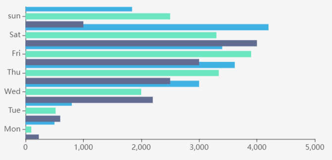
Bar charts
The bar chart uses the length of the bar as a variable
to indicate the data distribution. According to different styles, it can
be divided into bar chart, ranking bar chart and other types.
The configuration items of the bar chart are as follows:
- Data Source: The data source of the bar chart,
divided into map layers, public data, my data, services and time-series
data/map.
- Map Layer: If the layer in the added map component
has data records, you can add the data recorded in the layer.
- Public Data: public data in iPortal
- My Data: own data
- Time-series data/map: support two types of
time series data, fixed time period and relative time period (recent
time), the data response format supports GeoJSON/JSON, the response
result should be an object, and the object's key value (key) is unix timestamp。
- Service: supports iServer REST map service,
iServer REST data service, and third-party services in formats such
as GeoJSON/JSON. The response body of the third-party service needs
to include the data field. Take the JSON format as an example. The
example is as follows:
{
"data": {
"2017": 13020,
"2018": 19051,
"2019": 13692,
"2020": 19196,
"2021": 12072,
"2022": 16930
}
}
The configuration items
unique to service type data are as follows:
- Use iPortal to proxy requests: When unchecked,
requests will be sent based on the browser client. After checking,
requests will be sent by the iPortal server. This applies to situations
where the client and server have different network environments
or cross-domain access restrictions.
- Periodical refresh: the time interval to
refresh data regularly, the unit is second
- Data: the data item corresponding to the X
axis of the bar chart
- Unit: the unit of the bar chart X axis
- Axis line: Whether to display the X axis, support
setting the line color of the axis
- Scale: Whether to display the scale on the
X-axis of the bar chart, the minimum and maximum values of the scale
can be set
- Grid line: whether to display grid lines between
the X-axis data values of the chart, support setting the type, width,
transparency and color of the grid lines
- Label: Whether to display the label on the
X-axis of the chart, support setting the tilt angle of the label,
the distance between the label and the axis, the size, color and alignment
of the label text, etc.
- Data: the data item corresponding to the Y
axis of the bar chart
- Unit: the unit of the Y axis of the bar chart
- Axis blank: Whether to leave blank on the Y-axis
side of the bar chart
- Axis line: Whether to display the Y axis, support
the setting of the line color of the axis
- Scale: Whether to display the scale on the
Y-axis of the bar chart
- Grid line: whether to display grid lines between
the Y-axis data values of the bar chart, support setting the type,
width, transparency and color of the grid lines
- Label: Whether to display the label on the
Y-axis of the bar chart, support setting the tilt angle of the label,
the distance between the label and the axis, the size, color and alignment
of the label text, etc.
- Chart content:
- Data content:
- Displayed number: the maximum number of
X-axis data items displayed in the chart
- Data stacking display: used to set whether
to stack the data items when the X-axis corresponds to multiple
data items. If disabled, the data items will be displayed side
by side
- Animation delay: Whether to enable animation
delay when loading data content
- Area zoom: Whether to open the area zoom display,
you can choose automatic (automatically open the area zoom when the
current data is greater than 100), on or off, support the setting
of the start range, end range of the area zoom and the height of the
zoom bar. When you need to display too many data items, in order to
display the chart more beautifully and clearly, you can turn on the
area zoom display
- Sort: whether to sort according to the X-axis
data value, the sorting methods include ascending order, descending
order, support to set the sorting field, choose which data item to
sort according to the X-axis
- Legend: Whether to display the legend in the
chart, support setting the display position of the legend, the size
and color of the legend text
- Tooltip: When your mouse hovering over an item
in the chart, it will display the item information in a tooltip.
- Trigger: It includes two trigger types:
Axis and Item. When you choose Axis, the tooltip will display
all data items of current axis, and when you choose Item,
the tooltip will only display current hovering data item.
- Axis Pointer: When the trigger type is
Axis, it's a style that can be used to indicate the current data
item in the axis, including: line, shadow and cross.
- Title: The title content in the tooltip,
supports taking data name, series name and custom content as the
title.
- Field Name: The field name in the tooltip,
supports taking data name, series name and custom content as the
field name.
- Decimals: The decimal places can be automatically
set according to the data, or you can select fixed decimal places
- Separator: The symbol used as the thousands
separator
- Trigger On: The trigger conditions of displaying
tooltip, including: Mousemove and Click.
- Background Color: The background color
of the tooltip.
- Font Size: The size of the text in the
tooltip, in pixels.
- Font Color: The color of the text in the
tooltip.
- Transition Duration: Transition animation
duration when the tooltip position changes.
- Label style: Supports setting display style
for one or more value fields
- Value of label: Whether to display the value
label in the chart. If enabled, you can set the position of the label,
the maximum display number, the size and color of the font. And you
can also use the intelligent display setting.
- Threshold: Supports setting one or more threshold
areas for the value field of the current X axis, and customizing the
display color of the threshold area in the chart
- Color: the color of the bar in the chart
- Column width: the width of the bar in the chart.
0 means adaptive, ie., the bar width will dynamically adjust according
to the size of the bar chart component
- Border radius: the radius of the four vertices
of the bar in the bar chart
- Margin: Sets the distance between the chart
and the top, bottom, left, and right borders of the component
- Color: the color setting of the bar chart component
- Gradient: Whether to enable the color gradient
effect
- Color band: A variety of color bands are preset
in the bar chart component. You can directly choose one predefined
color band; or you can add a custom color band too. To add a custom
color band, you can click the "+" button at the bottom of
the color band list or click the edit icon on an existing color band.
- Highlight color: the highlight color of the
bar chart
- Background: the background setting of the bar
chart component
- Color: the background color of the component
- Gradient: Whether to enable the gradient effect.
If enabled, you can also choose the direction of the gradient effect.
The gradient color is related to the background color of the component
- Background image: The background picture of
the component, you can directly select the built-in picture material
as the background or add a custom background picture. When customizing
the background picture, you can add it by entering the picture address
and uploading the picture. You can also set the picture repeating
effect
- Size: the size of the bar chart component
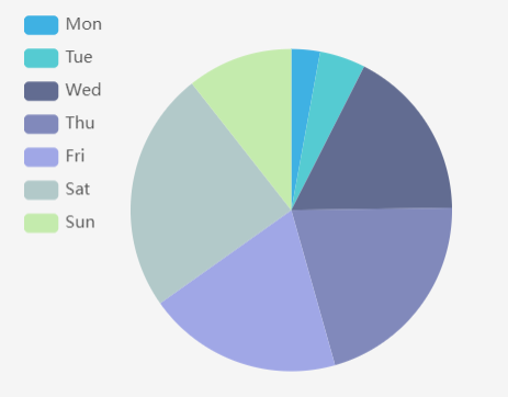
Pie charts
The pie chart can show the proportion of data by dividing
the size of the circle or sector. According to different styles, it can
be divided into ring chart, luminous ring chart, pie chart, Nightingale
rose chart and other types.
The configuration items of the pie chart are as follows:
- Data Source: The data source of the pie chart,
divided into map layers, public data, my data, services and time-series
data/map.
- Map Layer: If the layer in the added map component
has data records, you can add the data recorded in the layer.
- Public Data: public data in iPortal
- My Data: own data
- Time-series data/map: support two types of
time series data, fixed time period and relative time period (recent
time), the data response format supports GeoJSON/JSON, the response
result should be an object, and the object's key value (key) is unix timestamp
- Service: supports iServer REST map service,
iServer REST data service, and third-party services in formats such
as GeoJSON/JSON. The response body of the third-party service needs
to include the data field. Take the JSON format as an example. The
example is as follows:
{
"data": {
"2017": 13020,
"2018": 19051,
"2019": 13692,
"2020": 19196,
"2021": 12072,
"2022": 16930
}
}
The configuration items
unique to service type data are as follows:
- Use iPortal to proxy requests: When unchecked,
requests will be sent based on the browser client. After checking,
requests will be sent by the iPortal server. This applies to situations
where the client and server have different network environments
or cross-domain access restrictions.
- Periodical refresh: the time interval to
refresh data regularly, the unit is second
- Data field: select the category field and value
field of the data source in the pie chart
- Chart content:
- Data content:
- Displayed number: the maximum number of
data items displayed in the pie chart
- Animation delay: Whether to enable animation
delay when loading data content
- Direction: The arrangement direction of
the data content. You can choose clockwise or anticlockwise.
- Statistic: Whether to group attribute fields
and collect the attribute values for each group in the statistic mode.
View details: Chart Statistic.
- Sort: whether to sort according to the Y-axis
data value, the sorting methods include ascending order, descending
order, support to set the sorting field, choose which data item to
sort according to the Y-axis
- Legend: Whether to display the legend in the
chart, support setting the display position of the legend, the size
and color of the legend text
- Tooltip: When your mouse hovering over an item
in the chart, it will display the item information in a tooltip.
- Trigger: It includes two trigger types:
Axis and Item. When you choose Axis, the tooltip will display
all data items of current axis, and when you choose Item,
the tooltip will only display current hovering data item.
- Axis Pointer: When the trigger type is
Axis, it's a style that can be used to indicate the current data
item in the axis, including: line, shadow and cross.
- Title: The title content in the tooltip,
supports taking data name, series name and custom content as the
title.
- Field Name: The field name in the tooltip,
supports taking data name, series name and custom content as the
field name.
- Decimals: The decimal places can be automatically
set according to the data, or you can select fixed decimal places
- Separator: The symbol used as the thousands
separator
- Trigger On: The trigger conditions of displaying
tooltip, including: Mousemove and Click.
- Background Color: The background color
of the tooltip.
- Font Size: The size of the text in the
tooltip, in pixels.
- Font Color: The color of the text in the
tooltip.
- Transition Duration: Transition animation
duration when the tooltip position changes.
- Center point: Determine the center point of
the chart by setting the offset percentage of the chart on the X-axis
and Y-axis
- Autoplay: Whether to enable the animation effect
of scrolling data one by one
- Label style: Support setting display style
for one or more value fields
- Value of label: Whether to display the
value label in the chart. If enabled, you can set the position
of the label, the maximum display number, the size and color of
the font.
- Prompt text: If enabling the label display,
you can set the display format of the label in the prompt text
item. It supports four display formats: default (data name: data
value), data name, data value, and percentage; you can also set
the font size and color.
- Threshold: Support setting one or more
threshold areas for the current value field, and customizing the
display color of the threshold area in the chart
- Radius: Sets the radius of the pie chart
in the form of a percentage
- Starting angle: Sets the starting angle
of the current value field in the chart
- Margin: Sets the distance between the chart
and the top, bottom, left, and right borders of the component
- Color: the color setting of the pie chart component
- Gradient: Whether to enable the color gradient
effect
- Color band: A variety of color bands are preset
in the pie chart component. You can directly choose one predefined
color band; or you can add a custom color band too. To add a custom
color band, you can click the "+" button at the bottom of
the color band list or click the edit icon on an existing color band.
- Highlight color: the highlight color of the
pie chart
- Background: the background setting of the pie
chart component
- Color: the background color of the component
- Gradient: Whether to enable the gradient effect.
If enabled, you can also choose the direction of the gradient effect.
The gradient color is related to the background color of the component
- Background image: The background picture of
the component, you can directly select the built-in picture material
as the background or add a custom background picture. When customizing
the background picture, you can add it by entering the picture address
and uploading the picture. You can also set the picture repeating
effect
- Size: the size of the pie chart component
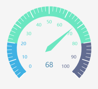
Gauge
The gauge displays data in the form of a dial, which
can visually display the progress of key data. According to different
styles, it can be divided into gauge, mark gauge, luminous gauge, and
spinning gauge.
The configuration items of the gauge are as follows:
- Data type: The data source of the gauge. You
can select a data source or use static data.
- Static data: Enters a fixed value in "Data"
box.
- Select data: Selects an existing data in the
dashboard as the data source
- Data: The numerical value style of the gauge,
which supports setting the font size and color of the numerical value
- Chart content:
- Radius: Sets the radius of the gauge sector
in the form of percentage
- Center point: Determines the center point of
the chart by setting the offset percentage of the chart on the X-axis
and Y-axis
- Angle: The angles of the left and right borders
of gauge. The right left of the circle is 180 degrees, the right above
is 90 degrees, and the right side is 0 degrees
- Title: Whether to display the title in the
chart. If enabled, you can set the text content, font size and text
color of the title.
- Pointer: Whether to display the pointer in
the chart. If enabled, you can set the length, width and color of
the pointer.
- Axis:
- Tick: Whether to display the scale of the gauge.
If enabled, the length, width, and color of the scale line can be
set.
- Split line: Whether to display the dividing
line of the gauge. If enabled, the number of the split lines, the
length, width, and color can be set
- Label: Whether to display the label inside
the gauge. If enabled, you can set the distance between the label
and the gauge, the range of the label value, the size, weight, and
color of the label text, etc.
- Line: Whether to display the axis of the gauge.
If enabled, you can set the width of the axis
- Threshold: Supports setting one or more threshold
ranges for the gauge value, and customizing the display color of the
threshold area in the chart
- Color: the color setting of the gauge component
- Gradient: Whether to enable the color gradient
effect
- Color band: A variety of color bands are preset
in the gauge component. You can directly choose one predefined color
band; or you can add a custom color band too. To add a custom color
band, you can click the "+" button at the bottom of the
color band list or click the edit icon on an existing color band.
- Background: the background setting of the gauge
component
- Color: the background color of the component
- Gradient: Whether to enable the gradient effect.
If enabled, you can also choose the direction of the gradient effect.
The gradient color is related to the background color of the component
- Background image: The background picture of
the component, you can directly select the built-in picture material
as the background or add a custom background picture. When customizing
the background picture, you can add it by entering the picture address
and uploading the picture. You can also set the picture repeating
effect
- Size: the size of the gauge component
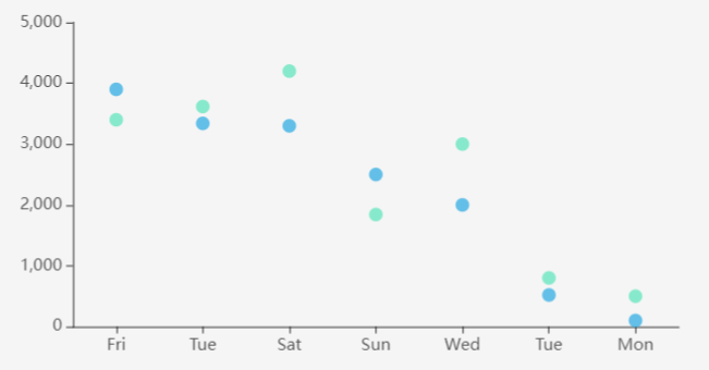
Scatter chart
The scatter chart shows the distribution and correlation
of data in the form of discrete points.
The configuration items of the scatter chart are as
follows:
- Data Source: The data source of the scatter
chart, divided into map layers, public data, my data, services and
time-series data/map.
- Map Layer: If the layer in the added map component
has data records, you can add the data recorded in the layer.
- Public Data: public data in iPortal
- My Data: own data
- Time-series data/map: support two types of
time series data, fixed time period and relative time period (recent
time), the data response format supports GeoJSON/JSON, the response
result should be an object, and the object's key value (key) is unix timestamp.
- Service: supports iServer REST map service,
iServer REST data service, and third-party services in formats such
as GeoJSON/JSON. The response body of the third-party service needs
to include the data field. Take the JSON format as an example. The
example is as follows:
{
"data": {
"2017": 13020,
"2018": 19051,
"2019": 13692,
"2020": 19196,
"2021": 12072,
"2022": 16930
}
}
The configuration items
unique to service type data are as follows:
- Use iPortal to proxy requests: When unchecked,
requests will be sent based on the browser client. After checking,
requests will be sent by the iPortal server. This applies to situations
where the client and server have different network environments
or cross-domain access restrictions.
- Periodical refresh: the time interval to
refresh data regularly, the unit is second
- Data: the data item corresponding to the X
axis of the scatter chart
- Unit: the unit of the scatter chart X axis
- Axis blank: Whether to leave blank on the X-axis
side of the scatter chart
- Axis line: Whether to display the X axis, support
setting the line color of the axis
- Scale: Whether to display the scale on the
X axis of the scatter chart
- Grid line: whether to display grid lines between
the data values on the X-axis of the scatter chart, and support to
set the type, width, transparency and color of the grid lines
- Label: Whether to display the label on the
X-axis of the scatter chart, support setting the tilt angle of the
label, the distance between the label and the axis, the size, color
and alignment of the label text, etc.
- Data: the data item corresponding to the Y
axis of the scatter chart
- Unit: the unit of the Y axis of the scatter
chart
- Axis line: Whether to display the Y axis, support
the setting of the line color of the axis
- Scale: Whether to display the scale on the
Y-axis of the scatter chart, the minimum and maximum values of the
scale can be set
- Grid line: whether to display grid lines between
the Y-axis data values of the scatter chart, support setting the type,
width, transparency and color of the grid lines
- Label: Whether to display the label on the
Y-axis of the scatter chart, support setting the tilt angle of the
label, the distance between the label and the axis, the size, color
and alignment of the label text, etc.
- Chart content:
- Data content:
- Displayed number: the maximum number of
X-axis data items displayed in the chart
- Animation delay: Whether to enable animation
delay when loading data content
- Statistic: Whether to group attribute fields
and collect the attribute values for each group in the statistic mode.
View details: Chart Statistic.
- Sort: whether to sort according to the Y-axis
data value, the sorting methods include ascending order, descending
order, support to set the sorting field, choose which data item to
sort according to the Y-axis
- Area zoom: Whether to open the area zoom display,
you can choose automatic (automatically open the area zoom when the
current data is greater than 100), on or off, support the setting
of the start range, end range of the area zoom and the height of the
zoom bar. When you need to display too many data items, in order to
display the chart more beautifully and clearly, you can turn on the
area zoom display
- Legend: Whether to display the legend in the
chart, support setting the display position of the legend, the size
and color of the legend text
- Tooltip: When your mouse hovering over an item
in the chart, it will display the item information in a tooltip.
- Trigger: It includes two trigger types:
Axis and Item. When you choose Axis, the tooltip will display
all data items of current axis, and when you choose Item,
the tooltip will only display current hovering data item.
- Axis Pointer: When the trigger type is
Axis, it's a style that can be used to indicate the current data
item in the axis, including: line, shadow and cross.
- Title: The title content in the tooltip,
supports taking data name, series name and custom content as the
title.
- Field Name: The field name in the tooltip,
supports taking data name, series name and custom content as the
field name.
- Decimals: The decimal places can be automatically
set according to the data, or you can select fixed decimal places
- Separator: The symbol used as the thousands
separator
- Trigger On: The trigger conditions of displaying
tooltip, including: Mousemove and Click.
- Background Color: The background color
of the tooltip.
- Font Size: The size of the text in the
tooltip, in pixels.
- Font Color: The color of the text in the
tooltip.
- Transition Duration: Transition animation
duration when the tooltip position changes.
- Label style: Supports setting display style
for one or more value fields
- Value of label: Whether to display the
value label in the chart. If enabled, you can set the position
of the label, the maximum display number, the size and color of
the font. And you can also use the intelligent display setting.
- Node style: Sets the scatter point style
corresponding to the current data item, support setting the size,
color, border width/color of the scatter point
- Threshold: Supports setting one or more
threshold areas for the value field of the current Y axis, and
customizing the display color of the threshold area in the chart
- Margin: Sets the distance between the chart
and the top, bottom, left, and right borders of the component
- Color: the color setting of the scatter chart
component
- Gradient: Whether to enable the color gradient
effect
- Color band: A variety of color bands are preset
in the scatter chart component. You can directly choose one predefined
color band; or you can add a custom color band too. To add a custom
color band, you can click the "+" button at the bottom of
the color band list or click the edit icon on an existing color band.
- Highlight color: the highlight color of the
scatter chart
- Background: the background setting of the scatter
chart component
- Color: the background color of the component
- Gradient: Whether to enable the gradient effect.
If enabled, you can also choose the direction of the gradient effect.
The gradient color is related to the background color of the component
- Background image: The background picture of
the component, you can directly select the built-in picture material
as the background or add a custom background picture. When customizing
the background picture, you can add it by entering the picture address
and uploading the picture. You can also set the picture repeating
effect
- Size: the size of the scatter chart component
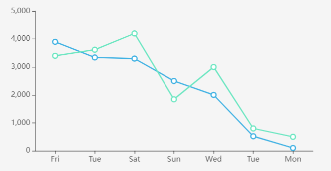
Line chart
The line chart displays the distribution and trend
of data by connecting the data points with line segments.
The configuration items of the line chart are as follows:
- Data Source: The data source of the line chart,
divided into map layers, public data, my data, services and time-series
data/map.
- Map Layer: If the layer in the added map component
has data records, you can add the data recorded in the layer.
- Public Data: public data in iPortal
- My Data: own data
- Time-series data/map: support two types of
time series data, fixed time period and relative time period (recent
time), the data response format supports GeoJSON/JSON, the response
result should be an object, and the object's key value (key) is unix timestamp.
- Service: supports iServer REST map service,
iServer REST data service, and third-party services in formats such
as GeoJSON/JSON. The response body of the third-party service needs
to include the data field. Take the JSON format as an example. The
example is as follows:
{
"data": {
"2017": 13020,
"2018": 19051,
"2019": 13692,
"2020": 19196,
"2021": 12072,
"2022": 16930
}
}
The configuration items
unique to service type data are as follows:
- Use iPortal to proxy requests: When unchecked,
requests will be sent based on the browser client. After checking,
requests will be sent by the iPortal server. This applies to situations
where the client and server have different network environments
or cross-domain access restrictions.
- Periodical refresh: the time interval to
refresh data regularly, the unit is second
- Data: the data item corresponding to the X
axis of the line chart
- Unit: the unit of the line chart X axis
- Axis blank: Whether to leave blank on the X-axis
side of the line chart
- Axis line: Whether to display the X axis, support
setting the line color of the axis
- Scale: Whether to display the scale on the
X axis of the line chart
- Grid line: whether to display grid lines between
the data values on the X-axis of the line chart, and support to set
the type, width, transparency and color of the grid lines
- Label: Whether to display the label on the
X-axis of the line chart, support setting the tilt angle of the label,
the distance between the label and the axis, the size, color and alignment
of the label text, etc.
- Data: the data item corresponding to the Y
axis of the line chart
- Unit: the unit of the Y axis of the line chart
- Axis line: Whether to display the Y axis, support
the setting of the line color of the axis
- Scale: Whether to display the scale on the
Y-axis of the line chart, the minimum and maximum values of the scale
can be set
- Grid line: whether to display grid lines between
the Y-axis data values of the line chart, support setting the type,
width, transparency and color of the grid lines
- Label: Whether to display the label on the
Y-axis of the line chart, support setting the tilt angle of the label,
the distance between the label and the axis, the size, color and alignment
of the label text, etc.
- Chart content:
- Data content:
- Displayed number: the maximum number of
X-axis data items displayed in the chart
- Data stacking display: used to set whether
to stack the data items when the Y-axis corresponds to multiple
data items. If disabled, the data items will be displayed side
by side
- Animation delay: Whether to enable animation
delay when loading data content
- Statistic: Whether to group attribute fields
and collect the attribute values for each group in the statistic mode.
View details: Chart Statistic.
- Area zoom: Whether to open the area zoom display,
you can choose automatic (automatically open the area zoom when the
current data is greater than 100), on or off, support the setting
of the start range, end range of the area zoom and the height of the
zoom bar. When you need to display too many data items, in order to
display the chart more beautifully and clearly, you can turn on the
area zoom display
- Sort: whether to sort according to the Y-axis
data value, the sorting methods include ascending order, descending
order, support to set the sorting field, choose which data item to
sort according to the Y-axis
- Legend: Whether to display the legend in the
chart, support setting the display position of the legend, the size
and color of the legend text
- Tooltip: When your mouse hovering over an item
in the chart, it will display the item information in a tooltip.
- Trigger: It includes two trigger types:
Axis and Item. When you choose Axis, the tooltip will display
all data items of current axis, and when you choose Item,
the tooltip will only display current hovering data item.
- Axis Pointer: When the trigger type is
Axis, it's a style that can be used to indicate the current data
item in the axis, including: line, shadow and cross.
- Title: The title content in the tooltip,
supports taking data name, series name and custom content as the
title.
- Field Name: The field name in the tooltip,
supports taking data name, series name and custom content as the
field name.
- Decimals: The decimal places can be automatically
set according to the data, or you can select fixed decimal places
- Separator: The symbol used as the thousands
separator
- Trigger On: The trigger conditions of displaying
tooltip, including: Mousemove and Click.
- Background Color: The background color
of the tooltip.
- Font Size: The size of the text in the
tooltip, in pixels.
- Font Color: The color of the text in the
tooltip.
- Transition Duration: Transition animation
duration when the tooltip position changes.
- Label style: Supports setting display style
for one or more value fields
- Value of label: Whether to display the
value label in the chart. If enabled, you can set the position
of the label, the maximum display number, the size and color of
the font. And you can also use the intelligent display setting.
- Node style: Sets the style of the inflection
point of the polyline corresponding to the current data item,
and supports the setting of the inflection point type (solid circle/hollow
circle), size, color, border width and color
- Threshold: Supports setting one or more
threshold areas for the value field of the current Y axis, and
customizing the display color of the threshold area in the chart
- Smoothed line: Whether to enable the polyline
smoothing effect
- Area style: whether to fill the area enclosed
by the polyline and the X axis, and supports setting the fill
color and transparency
- Margin: Sets the distance between the chart
and the top, bottom, left, and right borders of the component
- Color: the color setting of the line chart
component
- Gradient: Whether to enable the color gradient
effect
- Color band: A variety of color bands are preset
in the line chart component. You can directly choose one predefined
color band; or you can add a custom color band too. To add a custom
color band, you can click the "+" button at the bottom of
the color band list or click the edit icon on an existing color band.
- Highlight color: the highlight color of the
line chart
- Background: the background setting of the line
chart component
- Color: the background color of the component
- Gradient: Whether to enable the gradient effect.
If enabled, you can also choose the direction of the gradient effect.
The gradient color is related to the background color of the component
- Background image: The background picture of
the component, you can directly select the built-in picture material
as the background or add a custom background picture. When customizing
the background picture, you can add it by entering the picture address
and uploading the picture. You can also set the picture repeating
effect
- Size: the size of the line chart component
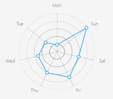
Radar chart
The radar chart uses the angle axis and the polar axis
to represent multivariate data.
The configuration items of the radar chart are as follows:
- Data Source: The data source of the radar chart,
divided into map layers, public data, my data, services and time-series
data/map.
- Map Layer: If the layer in the added map component
has data records, you can add the data recorded in the layer.
- Public Data: public data in iPortal
- My Data: own data
- Time-series data/map: support two types of
time series data, fixed time period and relative time period (recent
time), the data response format supports GeoJSON/JSON, the response
result should be an object, and the object's key value (key) is unix timestamp
- Service: supports iServer REST map service,
iServer REST data service, and third-party services in formats such
as GeoJSON/JSON. The response body of the third-party service needs
to include the data field. Take the JSON format as an example. The
example is as follows:
{
"data": {
"2017": 13020,
"2018": 19051,
"2019": 13692,
"2020": 19196,
"2021": 12072,
"2022": 16930
}
}
The configuration items
unique to service type data are as follows:
- Use iPortal to proxy requests: When unchecked,
requests will be sent based on the browser client. After checking,
requests will be sent by the iPortal server. This applies to situations
where the client and server have different network environments
or cross-domain access restrictions.
- Periodical refresh: the time interval to
refresh data regularly, the unit is second
- Data: Used to select the category field and
value field of the data source in the radar chart
- Chart content:
- Data content:
- Displayed number: the maximum number of
X-axis data items displayed in the chart
- Animation delay: Whether to enable animation
delay when loading data content
- Statistic: Whether to group attribute fields
and collect the attribute values for each group in the statistic mode.
View details: Chart Statistic.
- Legend: Whether to display the legend in the
chart, support setting the display position of the legend, the size
and color of the legend text
- Tooltip: When your mouse hovering over an item
in the chart, it will display the item information in a tooltip.
- Trigger: It includes two trigger types:
Axis and Item. When you choose Axis, the tooltip will display
all data items of current axis, and when you choose Item,
the tooltip will only display current hovering data item.
- Axis Pointer: When the trigger type is
Axis, it's a style that can be used to indicate the current data
item in the axis, including: line, shadow and cross.
- Title: The title content in the tooltip,
supports taking data name, series name and custom content as the
title.
- Field Name: The field name in the tooltip,
supports taking data name, series name and custom content as the
field name.
- Decimals: The decimal places can be automatically
set according to the data, or you can select fixed decimal places
- Separator: The symbol used as the thousands
separator
- Trigger On: The trigger conditions of displaying
tooltip, including: Mousemove and Click.
- Background Color: The background color
of the tooltip.
- Font Size: The size of the text in the
tooltip, in pixels.
- Font Color: The color of the text in the
tooltip.
- Transition Duration: Transition animation
duration when the tooltip position changes.
- Radius: Sets the radius of the polar axis of
the radar chart in percentage
- Center point: Determine the center point of
the chart by setting the offset percentage of the chart on the X-axis
and Y-axis
- Label style: Supports setting display style
for one or more value fields
- Value of label: Whether to display the
value label in the chart. If enabled, you can set the position
of the label, the maximum display number, the size and color of
the font. And you can also use the intelligent display setting.
- Node style: Sets the style of the inflection
point of the polyline corresponding to the current data item,
and supports the setting of the inflection point type (solid circle/hollow
circle), size, border width and color
- Color: the color setting of the radar chart
component
- Gradient: Whether to enable the color gradient
effect
- Color band: A variety of color bands are preset
in the radar chart component. You can directly choose one predefined
color band; or you can add a custom color band too. To add a custom
color band, you can click the "+" button at the bottom of
the color band list or click the edit icon on an existing color band.
- Highlight color: the highlight color of the
radar chart
- Background: the background setting of the radar
chart component
- Color: the background color of the component
- Gradient: Whether to enable the gradient effect.
If enabled, you can also choose the direction of the gradient effect.
The gradient color is related to the background color of the component
- Background image: The background picture of
the component, you can directly select the built-in picture material
as the background or add a custom background picture. When customizing
the background picture, you can add it by entering the picture address
and uploading the picture. You can also set the picture repeating
effect
- Size: the size of the radar chart component
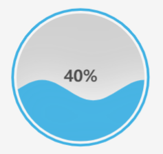
Liquid Fill chart
The liquid fill chart is usually used to represent
data in percentage.
The configuration items of the liquid fill chart are
as follows:
- Data type: The data source of the liquid fill
chart. You can select a data source or use static data.
- Static data: Enters a fixed value in the "percentage"
box.
- Select data: Selects an existing data in the
dashboard as the data source
- Percent type: The unit range of percentage,
divided into 0-1 and 0-100
- Decimal Places: The decimal places can be automatically
set according to the data, or you can select fixed decimal places
- Wave style: The style settings of liquid wave
- Wave animation: whether to enable the wave
animation effect
- Wave number: the number of wave layers of the
liquid fill chart
- Font size: the size of the text in the liquid
fill chart, in pixels
- Font color inside wave: the color of the text
in the wave
- Font color outside wave: the color of the text
outside the wave
- Fill color: the fill color of the liquid fill
chart
- Wave color: the color of the wave
- Border color: the color of the border of the
liquid fill chart
- Background: the background setting of the liquid
fill chart component
- Color: the background color of the component
- Gradient: Whether to enable the gradient effect.
If enabled, you can also choose the direction of the gradient effect.
The gradient color is related to the background color of the component
- Background image: The background picture of
the component, you can directly select the built-in picture material
as the background or add a custom background picture. When customizing
the background picture, you can add it by entering the picture address
and uploading the picture. You can also set the picture repeating
effect
- Size: the size of the liquid fill chart component
ProgressBar
The progress bar component shows the progression of
the completion of a task.
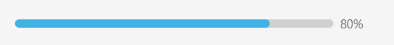
The configuration items of the progress bar chart are
as follows:
- Data type: The data source of the progressBar
chart. You can select a data source or use static data.
- Static data: Enters a fixed value in the "percentage"
box.
- Select data: Selects an existing data in the
dashboard as the data source
- Percent type: The unit range of percentage,
divided into 0-1 and 0-100
- Style:
- Current state: The state of the progress bar,
including normal, success, abnormal, active.
- Width: The width of the progress bar, in pixels
- Color: The foreground color of the progress
bar
- Trail color: The background color of the progress
bar
- Font color: The text color of the progress
bar
- Background: the background setting of the progress
bar component
- Color: the background color of the component
- Gradient: Whether to enable the gradient effect.
If enabled, you can also choose the direction of the gradient effect.
The gradient color is related to the background color of the component
- Background image: The background picture of
the component, you can directly select the built-in picture material
as the background or add a custom background picture. When customizing
the background picture, you can add it by entering the picture address
and uploading the picture. You can also set the picture repeating
effect
- Size: the size of the progress bar component
Ring ProgressBar
The ring progress bar component shows the progression
of the completion of a task in the form of a ring.
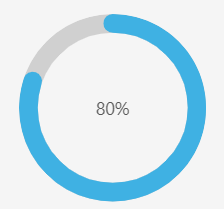
The configuration items of the ring progress bar chart
are as follows:
- Data type: The data source of the ring progress
bar chart. You can select a data source or use static data.
- Static data: Enters a fixed value in the "percentage"
box.
- Select data: Selects an existing data in the
dashboard as the data source
- Percent type: The unit range of percentage,
divided into 0-1 and 0-100
- Style:
- Current state: The state of the ring progress
bar, including normal, success, abnormal, active.
- Width: The width of the ring progress bar,
in pixels
- Color: The foreground color of the ring progress
bar
- Trail color: The background color of the ring
progress bar
- Font color: The text color of the ring progress
bar
- Background: the background setting of the ring
progress bar component
- Color: the background color of the component
- Gradient: Whether to enable the gradient effect.
If enabled, you can also choose the direction of the gradient effect.
The gradient color is related to the background color of the component
- Background image: The background picture of
the component, you can directly select the built-in picture material
as the background or add a custom background picture. When customizing
the background picture, you can add it by entering the picture address
and uploading the picture. You can also set the picture repeating
effect
- Size: the size of the ring progress bar component