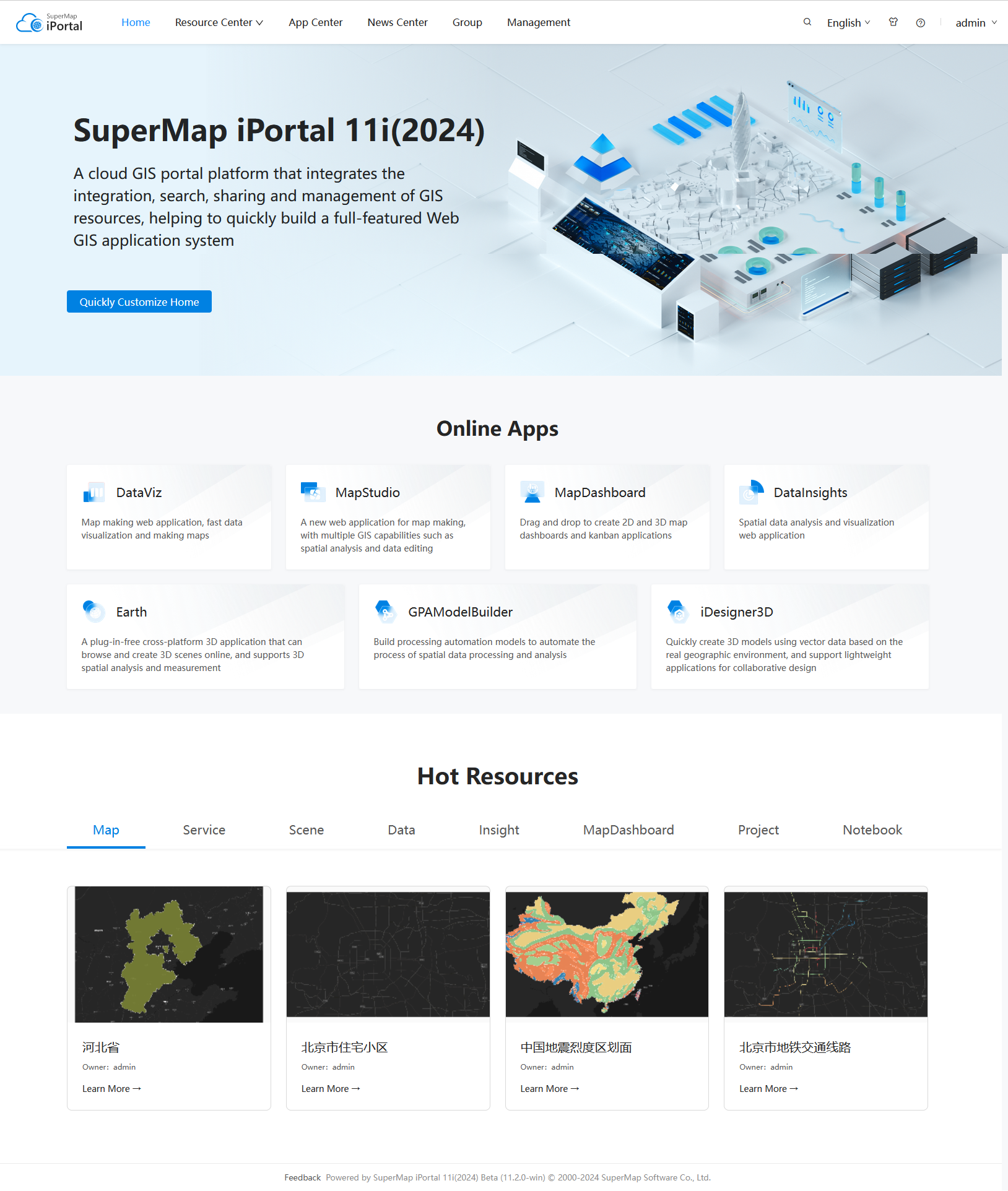
Homepage customization |
All the parts of the iPortal homepage: header, body, and footer support visual customization. And the customized header and footer apply to the whole portal website.
Log in iPortal as the administrator role, enter Home>Management>Site Configuration>Site Customization, click the "Home customize" link on the right panel, or directly access http://<server>:<port>/iportal/web-ui/home/edit to enter the homepage edit interface. At this time, the contents of the homepage are displayed in the edit state, you can move, edit, and delete components WYSIWYG. Click the gear icon on the left side, the expanded sidebar supports homepage international customization, enable/display Preview, Regular Content settings, adding components from the LayoutBuilder to the right edit area, Restore Default setting, and Save. After complete and save the customization changes, you can click the portal Logo on the upper-left corner to exit the homepage customization mode. Note, the homepage international customization defaults to Chinese, i.e., you're customizing the homepage contents under the Chinese environment by default. Below will introduce each setting in detail.
On the homepage edit interface, click the upper-left gear icon, in the expanded sidebar click the "Regular content" to set the following contents. After completion, click the "OK" button below, the right edit area will update the changes. You can also click the global Save button on the upper-right of the sidebar to save the changes.
iPortal provides a default Logo, you can change it via "Upload Logo". The required image should be in gif, png, or jpg format, and the recommended size is 43px*43px. To restore to the default Logo, click the "Use defaultLogo" button.
The name of the portal website, which is displayed on the right of the Logo. The value can be empty, too.
iPortal provides a default tab icon, you can change it by clicking on the default icon, The required image should be in png, or jpg format, and the recommended size is 32px*32px.
The name of the portal tab name, which is displayed on the right of the tab icon. To restore to the default tab name, just set the tab name to empty.
Two modes are provided: the default mode and the Tianditu style mode. If you switched to the Tianditu mode, after clicking the "OK" button below, both the portal header and footer will be replaced with the Tianditu style mode. At this time, in the right edit area, you can edit the footer component visually.
Check or uncheck the box before the "Display help document link" to control whether to show the online documentation link on the header bar. The link address supports modification.
Turn on or off the "Display language switcher" to control whether to display the language switcher component of the website footer.
Copyright information of the portal website showed on the footer. You can modify the default copyright information.
In the Regular Content panel, you can modify the navigation bar mode. While to edit the contents of the navigation bar, you need to carry them out in the right edit area. Move the mouse to the navigation bar component, click the "Edit Component" button, in the "Menus edit" popup, you can do the following actions:
When completing the edit, click the "Save" button on the bottom to take effect.
By using the navigation bar edit function, you can easily integrate custom items, such as the Example: Add a customized "Development Center" navigation bar.
After adding a component to the right edit area, you can make the 12-grid layout for the row of the component, i.e., divide a row into 12 equal parts. Below will have a brief introduction of the grid layout principle:
Specific operation:
In the right edit area, hover the mouse on a specific row of a component, click the appeared "Edit Row" button, the left side will show the Layout Builder, in which you can set the layout of components in this row. The system provides two alignment modes: Auto and Custom. Auto is used by default, i.e., the components in the same row are aligned with equal width. You can also choose the Custom alignment method to manually adjust the range a component spans in a row. To complete this, in the "Grid Layout" input box, enter a series of values separated with ",". Note: The sum of the digital values must be equal to 12; the number of the input values must equal the number of components; you can add 6 components in a row at most.
You can also adjust the row spacing between the current row and the next row, the row background color(disabled by default), and the row align center(the components of a row will be displayed in the center with a fixed size. By default, the components of a row will be stretched according to the screen size and displayed in the center).
On the homepage edit interface, click the gear icon on the upper-left corner, in the expanded sidebar click the "Layout Builder", you can see the components the portal provided, which support to add by click or drag to the right edit area. A single row allows adding 6 components at most. The components added to the right edit area adopt row layout by default. Hover the mouse on the row of an added component, you can set the row layout; hover the mouse on an added component, it will display the edit, delete, and drag component buttons, you can edit, remove, and drag to adjust the layout via these buttons. The positions of the components in each row can be swapped left and right, and the positions of each row can be swapped up and down.
The Banner contains a background image and supports setting the title, subtitle, button, and the hyperlink on the background image. If all the title, description, and text of the button are empty, the Banner will only show the background image.
The Card Carousel component allows you to set up a group of rotating cards, and each card is composed of a background picture and subtitle. You can modify the height, play mode, indicator arrow and indicator dot of the component, etc. You can also individually set the background picture, hyperlink, subtitle content and layout style for each card.
The Shortcut contains an icon, title, description, and hyperlink. You can modify the default icon, title, description, and hyperlink address.
The functions and operations are the same as the Shortcut component. The only difference is the display style.
The Shortcut contains an icon, background image, title, description, and hyperlink. You can modify the default icon, background image, title, description, and hyperlink address.
The hot resources component, containing the title, resource type and thumbnails. You can modify the title, the resource sorting method, or display/hide specific types of resources.
The functions and operations are the same as the Resource Card component. The only difference is the display style.
The Map component allows you to add the Tianditu map or the public maps in the portal, and the Tianditu map is used by default. Map adding method: hover the mouse on the added Map component and click the "Edit Component" button, in the left-side Map Setting panel, choose the map type, map id, Tianditu key(If the portal map you choose has a Tianditu layer, or if you choose the Tianditu map type, you need to fill in the Tianditu key), map component height, the longitude and latitude of map center, and the map level. Note: A temporary Tianditu key is provided by iPortal by default. But we recommend you to apply an official key for your actual production environment.
The Icon List contains six items by default, and each item has icon and title , and supports click action. You can add or delete the items, but you can only add six items at most. Each item supports uploading a new icon, modifying the title and the hyperlink address.
The Iframe component allows you to embed a third-party application. You can modify the component's height and the hyperlink address.
The Title component is used to add title for a section in the portal homepage. You can modify the title, link text, and hyperlink address.
The Image List is a list component containing four images by default. You can modify the image, the image's hyperlink, add or delete images.
The Icon Content is a component with one row and two columns and has three rows in total by default. Each item has an icon, title, description, and hyperlink address. You can modify the attributes of the item, add or delete items. When adding a new item, the component will place this item to the bottom with a one-row and two-column layout.
The Text Block contains a piece of text, a button, and the button link. You can modify the texts, the text of the button, and the link address of the button.
The Text List contains five columns of text. Each column contains a title, the link of the title, and sub-items. You can modify the background image of this component, display/hide a specific column, modify the title and link of the item and sub-items.
The News component allows you to set the title, right link text, the link address, the number of rows, the news sorting method(latest or most visited), and the height of the News component. If the height occupied by the number of rows exceeds the News component's height, the news items are automatically displayed in a scrolling manner.
The Text component is used to add a piece of text to the portal homepage. You can modify the font, size, weight, style, alignment, line height, first line indentation and color of the text, etc. It also allows you to add hyperlinks to the text.
The Video component is used to add a video to the portal homepage. You can modify the size, playback mode of the video, mute or not, etc. And you can also add a control bar for the video.
The Histogram component is used to add a histogram to the portal homepage. The types of histograms provided include regular histogram, cube histogram, cuboid histogram and cylindrical histogram. It supports setting the data source of the histogram. Supports setting the color, axis line, scale, grid line, and label of the X axis and Y axis. Supports setting the color, tag, height, background, and margin of the chart content, etc.
The Bar component is used to add a bar chart to the portal homepage. It supports setting the data source of the bar chart. Supports setting the color, axis line, scale, grid line and label of the X axis and Y axis. Supports setting the color, label, height, background and margin of the chart content.
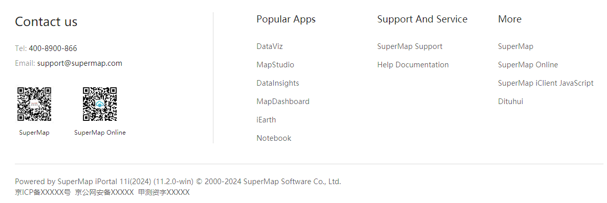
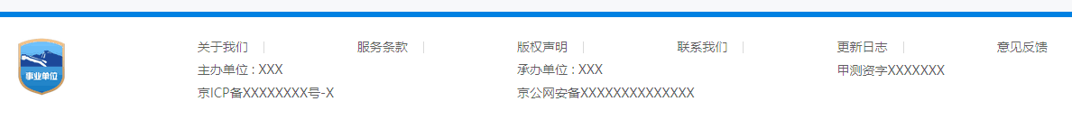
iPortal provides several sets of different styles of footer, which can be switched in the Footer style TAB in the left sidebar. Different styles of footer have different Settings, which can be used to build various styles of portal sites.
iPortal default footer uses a single-line layout mode, suitable for more concise portal site construction.

The style Settings include:
The style Settings include: content width, Logo, two-dimensional code, drop-down list, text links, contact information, record information, language switching, copyright information, and so on. After switching to this style, you can hover the mouse over the location of footer in the editing area on the right side of the interface and click the emerging edit button to visually edit footer.

The style Settings include: content width, two-dimensional code, website list, contact information, record information, language switching, copyright information, etc. After switching to this style, you can hover the mouse over the location of footer in the editing area on the right side of the interface and click the emerging edit button to visually edit footer.
This style is World map style. After you switch the navigation bar mode to World map style, the footer will automatically switch to world map style and cannot be changed to other styles. In the editing area on the right side of the interface, hover the mouse over the location of footer and click the emerging edit button to visually edit the content of footer in the map.
iPortal supports the homepage customization of Chinese and English languages by default. The language of the homepage customization is Chinese by default, you can switch to English to customize the English homepage. If you have customization needs in other languages, you should do the multi-language configuration for your portal website first. After finished the configuration and restarted the iPortal, the "Language" drop-down list of the homepage international customization will list the new language you added, switch to this new language to start the configuration. Note: When customizing the homepages in different languages, the components in the body area are shared, i.e., if you delete a component of an English-version homepage, the component on the Chinese-version homepage will be deleted, too. While the contents of the header and footer in different language homepages can be different.
After completed the homepage customization, you can turn on the "Preview" in the left panel to preview the customization effect and click the "Save" button on the top to save and publish. It's recommended to save the modification of each component in time. Note: The preview mode doesn't allow you to edit or delete components.
The "Restore Default setting" allows you to restore the homepage to the default look. But note that once you use the restore function, all your modifications on the homepage will be lost. So be cautious when you choose to restore.